Honor. Tradition. Strength. Grit.
When alumni, current students, coaches, faculty, staff, and other individuals were asked, “What do you think of when you hear Sam Houston State University?”, these words were repeated across the polled populace. How does one take those words and pare them down so they are reflected in a logo, through a mascot, and ultimately into a strong, unwavering future of a university? Russell Martinez, Associate Athletic Director for External Operations, explained the process of updating the symbols that project the valor and sense of community future Bearkats and alumni hold dear. “Tradition is not just for the time you spent at Sam Houston; tradition dates back to when this institution started in 1879. Then, it is built on every year, by every class.”
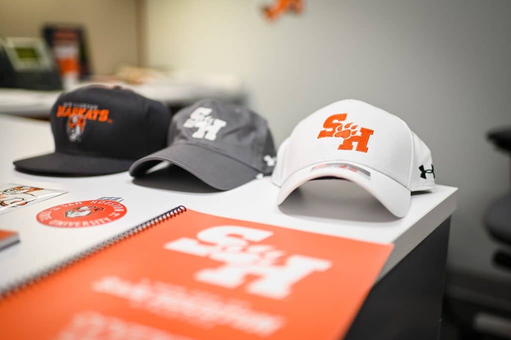
“In this day of the power of the brand, it is important to have some consistency, not only in terms of a logo, but also what represents the institution,” Martinez, shared. “Under the original SH-Paw, we experienced one of our most successful decades in the university’s athletic history.” A Bearkat that looked more like a tiger was added in the mid-90s, but it did not sustain any official longevity. “The logo had a very 90s feel to it, with graffiti edges, etc. As digital media became more in use and textiles became more detailed, our mark became difficult to reproduce. Since there was no consistency in the logos being reproduced for us, it was too difficult to obtain a federal copyright.” Case in point, as six coaches arrived for a focus group, six different logos came through the door. “Not one of them had the same SH-Paw logo on. Dependent on where you ordered the merchandise, that determined what logo was received. Our licensees were not replicating our logo correctly. There was a lot of brand confusion, and the orange and white was getting lost. It was also important to us to bring Sammy back to the forefront,” Martinez pointed out. The licensees now have an easier logo to reproduce, and the cost of reproduction has decreased. “The paw is modernized with a lot of motion to it. It is moving forward with aggression. It is a very clean mark, and each team has its own wordmark.”
SME out of New York City, who are connected to CLC Licensing, the school’s licensee, was tasked with giving Sam’s logo its facelift. “We told them to take the wheels off. ‘We want to see the widest scope of what you think represents the university.’ We knew that anything too far ‘out there’ would not work, but we still wanted to see it. We made sure to pay attention to every detail,” Martinez commented. Although he had not been involved in a branding process or logo design before, Russell enjoyed watching the evolution of previous elements of the logo into a modern, yet traditional symbol. After culling the number of 20-30 designs down to two, focus groups of alumni donors, student athletes, students, faculty, staff, and coaches were shown the end product. “We received mixed results. It takes a while to digest and accept change. Once the participants got past the initial shock, the overwhelming majority of participants really liked the new look. The company emboldened the primary mark. We also were not sure how Sammy was going to be depicted in this new direction. We viewed about four or five different versions: from a “Tom and Jerry” looking cat to the strong mascot from the 1950s. We are going back to the tradition of orange and white. Since we have launched the new look, we have received great, positive feedback from leaders in the collegiate athletic marketing and branding industry. Change can be shocking, but I encouraged everyone to ‘let it breathe like a wine’. The updated Sammy has some battle-marks and scars, with a one of his teeth showing. We have the brand showing the full-sized Sammy and also a representation showing just his head. This gives us all sorts of options when we are creating apparel for our athletes or items for retail. Now that people have seen the SH-Paw in reproduction, on helmets, uniforms, caps, etc., they love it! We now have consistency across the board! Each team possesses its own wordmark.”
A great internal committee of people worked alongside Russell to successfully bring this project to fruition: Trevor Isaminger, Kyle Barnard, Josh Weitz, Travis Lies, Nick Olsson, and Stephanie Knific. “Athletic Director Bobby Williams and the previous University President, Dr. Dana Hoyt, put me in charge of this project and let me run with it. I told Bobby the day the logo launched, ‘You gave me the keys to your car, and entrusted me with this task,” Russell stated. They worked together to ensure the new mark would be polished, professional, and powerful. “Everything was completed strategically. From the planning to the design to the rollout, I was able to use my background in politics to guide the strategy. It was a true team effort! This was one of the most exciting and rewarding things I have done in my life…I will always be part of this effort to leave a mark on this university. As an alum and an employee, that means a lot…to know that when we play on television, a project I worked on will be visible.”
The university created a video to launch the new, strong, consistent logo. “We really wanted to tie into the community. My memories of Sam Houston as a kid were the Homecoming Parade, the football games at Pritchett Field, Sammy, Orange and White everywhere. That is the emotion we wanted strike with people. To get people to buy in, you want to pull at their emotions. We wanted to pull in those who felt they had been disconnected from the university and pay homage to the men and women who had been here before us. Community is Bearkat, and Bearkat is community. The video ties into a lot of history. We reached into the archives and pulled as many things as we possibly could, and married it with the modern,” Martinez said. The video won a gold rating in an industry awards competition and will be entered in the Major Athletics Association contest as well (The video can be viewed on the Bearkat Athletics Facebook page.). Sam Houston’s Videographer, Mike Foster, filmed and edited this project along with Jason Barfield, Sports Information Director, who provided the athletics footage. “We worked collaboratively on an overall theme. The final piece, where Mike was able to take our new marks and animate them in the video, made me very emotional. Everything we had worked on for two years was finished!” Russell reflected.
Come to the games and support the athletes as they don the new look and continue to carry on Tradition with Strength, Honor, and Grit!


